The 2013 NFL season is well underway. So let’s talk about team logos. Over the years, I’ve noticed a few logo changes, with a handful of franchises—and while most are visual improvements, some have simply reverted backwards, leaning more on the marketing power of nostalgia—and oh, how powerful it can be!
PART I: The New York Jets
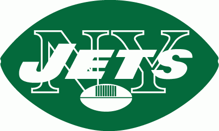
Lets look at the New York Jets. Lets face it, At first glance, it looks like a high-school logo project. Its the word ‘JETS’ in all caps overlaying a large ‘NY’ with a small football centered in the bottom, all encompassed by a football-shaped oval. A football logo inside a football. Brilliant…but wait, this logo is nearly identical to the one that the great Joe Namath donned on helmet during their magical Superbowl III win in 1969! Ofcourse!
1968

Broadway Joe would retire 3 years later due to injuries, and the team would go on a downward spiral over the next decade. The logo would eventually become a symbol of failure and frustration. People started to see it for what it was…an ugly logo.
In 1978, the franchise felt it was time for a rebrand to boost team and fan morale—and of course—merchandise sales. Thus the more streamlined, professional and modern Jets Logo was born. This time, the logo had a much less cluttered, professional feel. I vast improvement over its predecessor. The logo conveyed speed, and actually featured an appropriate graphic translation of a Jet. It was a much more corporate look, but it was created for a more corporate era.
1978
The new improved supercool, superfast modern logo was the symbol of a much improved football franchise—for the first several years at least, including an appearance in the 1982 AFC Championship Game. However, after a steady decline of respectable teams in the 90’s, the new improved supercool superfast modern logo also would eventually become a symbol of failure and frustration. Ugh!
1998
Once again, it was time for a brand overhaul, to boost team and fan morale—and of course—merchandise sales. So, what to do? The ‘improved’ look worked for a brief period, but eventually became overshadowed by a team with few stars and little talent. People have short memories. Just an in many toxic relationships, the best memories tend to greatly overshadow the bad ones. The greatest memory, was still of that magical superbowl III win in 1969. Perhaps the one event that solidified historic status, and a lasting fanbase, despite enduring so many years of disappointment. Nostalgia won out, and thus a tidied-up version of the logo that Broadway Joe had on his helmet (also, many failed teams years after) became the new symbol of hope for the franchise.
Interestingly enough almost immediately after the ‘new throwback brand’ was established, the Jets experienced a shot in the arm and would go on to have perhaps it’s strongest decade and a half of football, although recent years have trended toward another decline, and the lack of Superbowl appearances has started to weigh heavy on their fanbase.
If the Jets’ current woes become part of an ongoing trend, we will likely see another rebrand soon as it could once again become a symbol of failure and frustration. Fans will eventually move past the nostalgia and see it for what it is…an ugly logo.
This entry was posted in Articles. Bookmark the permalink.
Comments are closed.